%20copy.png)
.png)
.png)


I worked on this project as a Senior Product Designer.
Main areas of responsibility:
As a part of Noon Academy’s growth and market expansion plan, this project was one of many projects that follow the new design direction towards becoming a more interactive platform, and designing gamified features and designs based on the “social learning” theories.
The group redesign was a major and important project as it involved: 1- Fixing existing problems related to the group’s homepage and interactions between the students 2- Enhancing the students satisfaction with the social networking services in Noon Academy.
The project required:
First, researching, identifying the existing problems, collecting data, and conducting interviews with the students.
Second, redesigning the group’s homepage based on the collected data and reports in terms of experience, visual interface, and feature-set.
Third, testing and getting feedback about the improved design.
The redesign targeted visual, content, layout, navigation, and interaction designs.
.jpg)
Redesigns are beneficial as they fix existing issues, allow users discover new features, and present fresh designs.
We decided to work on the group’s redesign because Noon Academy has kept its old group design for long, precisely for the last 3 years, but now it is time for maximizing the students’ satisfaction with the group experience through the new redesign.
Major customizations were added to enable teachers to manage and get the best use from their groups in Noon Academy.
A closer look at how “the group” in Noon Academy looks:
The group in Noon Academy is created by the teacher. Each teacher can create a public/private group for each grade and for each subject he teaches. He can add a name and a description for the group and can either invite or receive invitations from students to join. The teacher also can start schedule live sessions, add assignments, interact with students in the group feed, and do many other activities with his students.
On one hand, we noticed that teachers can be categorized to have one of these use cases (formats) for creating a group:
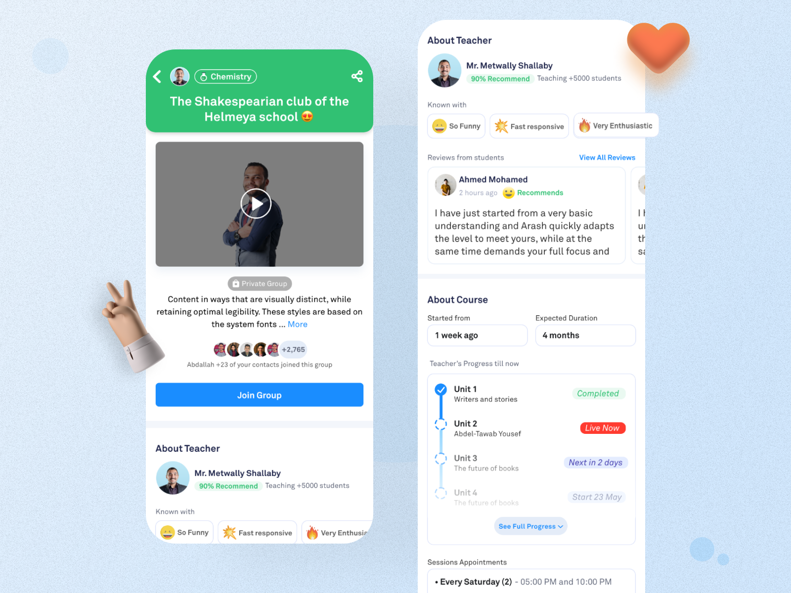
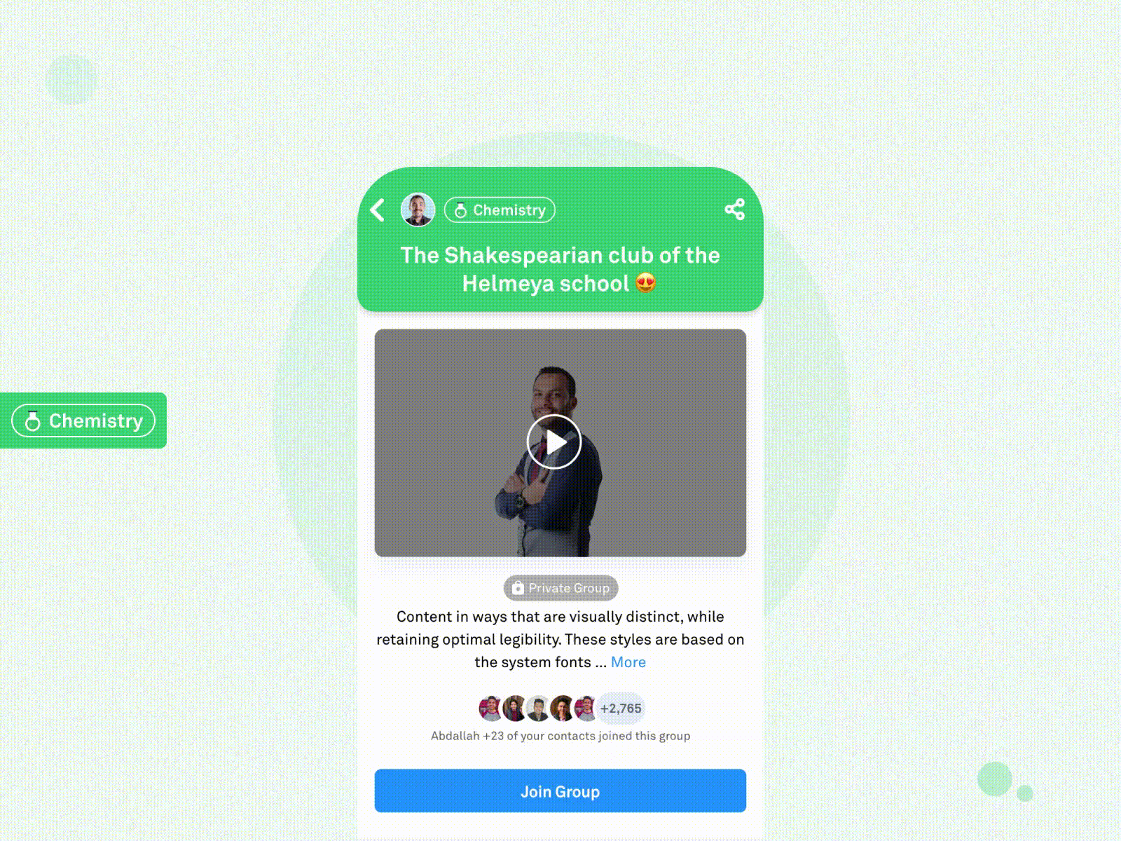
Before joining the group (Non-member view)

After joining the group (Member view)
Problems that face students (members in the group):
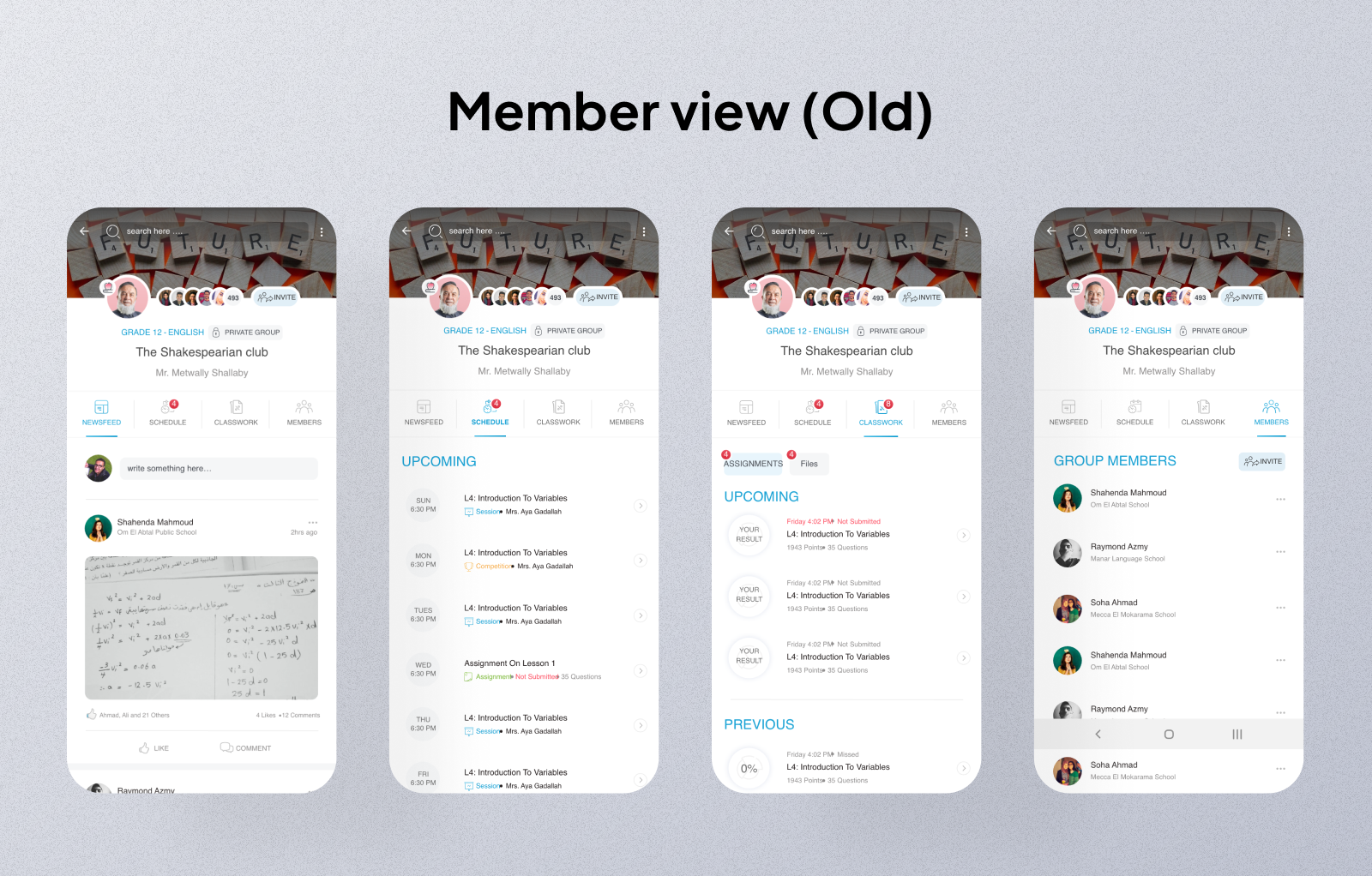
Before joining the group (Non-member view)
The students see this view when they view a group that they aren’t a member of. Most probably it’s their first visit for the group.
The students for sure want a glimpse about what kind of info is shared inside the group to decide whether to join or not. Such info are about one of these options:
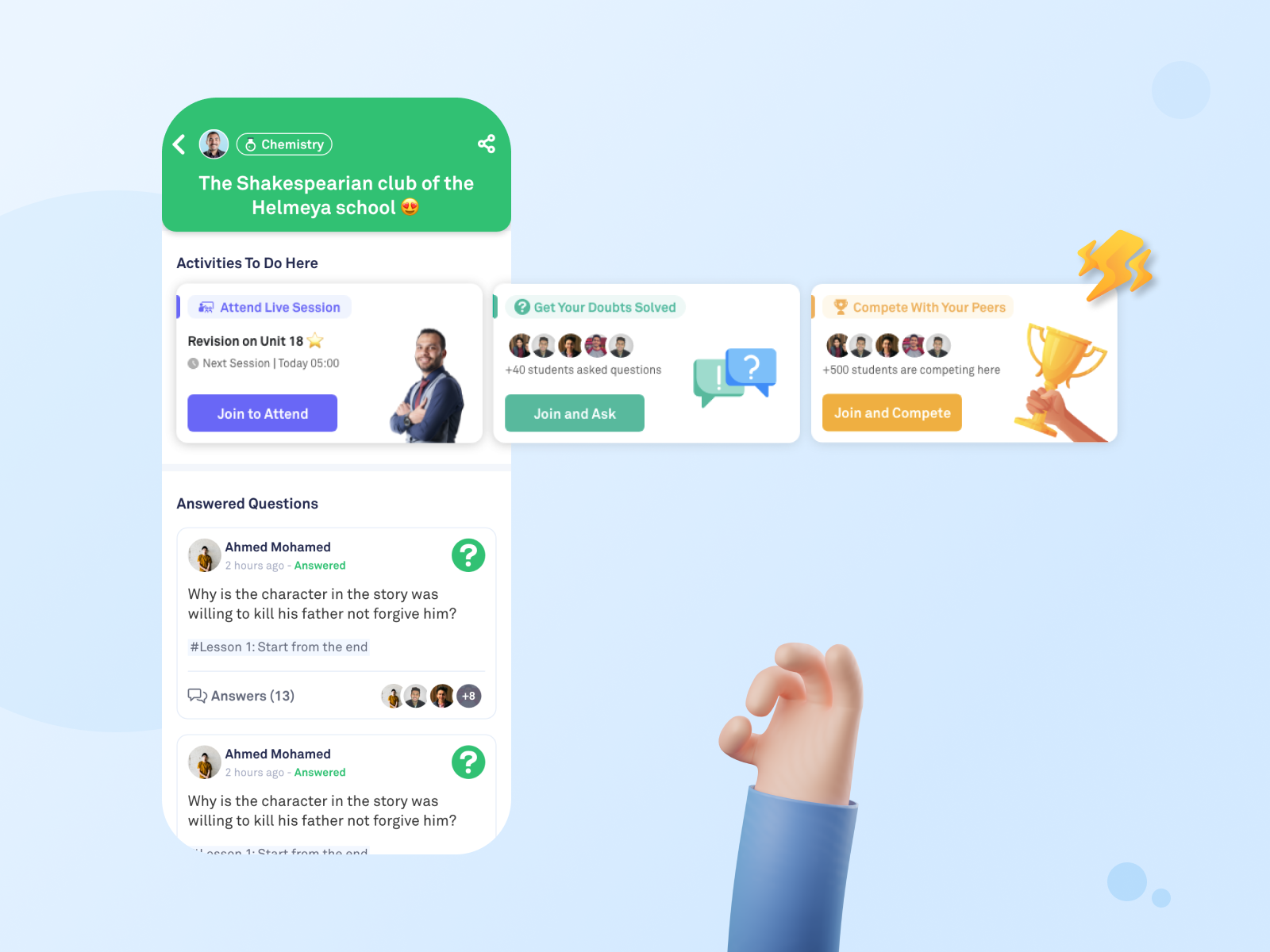
After joining a group
The students either want to interact with the teacher and other students or both. So, we focused on designing interactive features that enable students to:
The goal here is allow the students to see some of the benefits of being a member in the group to take the right action and join the group based on info they see about the teacher and the content inside.
So, what did we add in the group redesign (non-member view)?
It’s 2 mins video made by the teacher to describe the group and what the students will study inside. This allows the students to listen and see the teacher and get to decide if this is the best group and teacher for them or not.
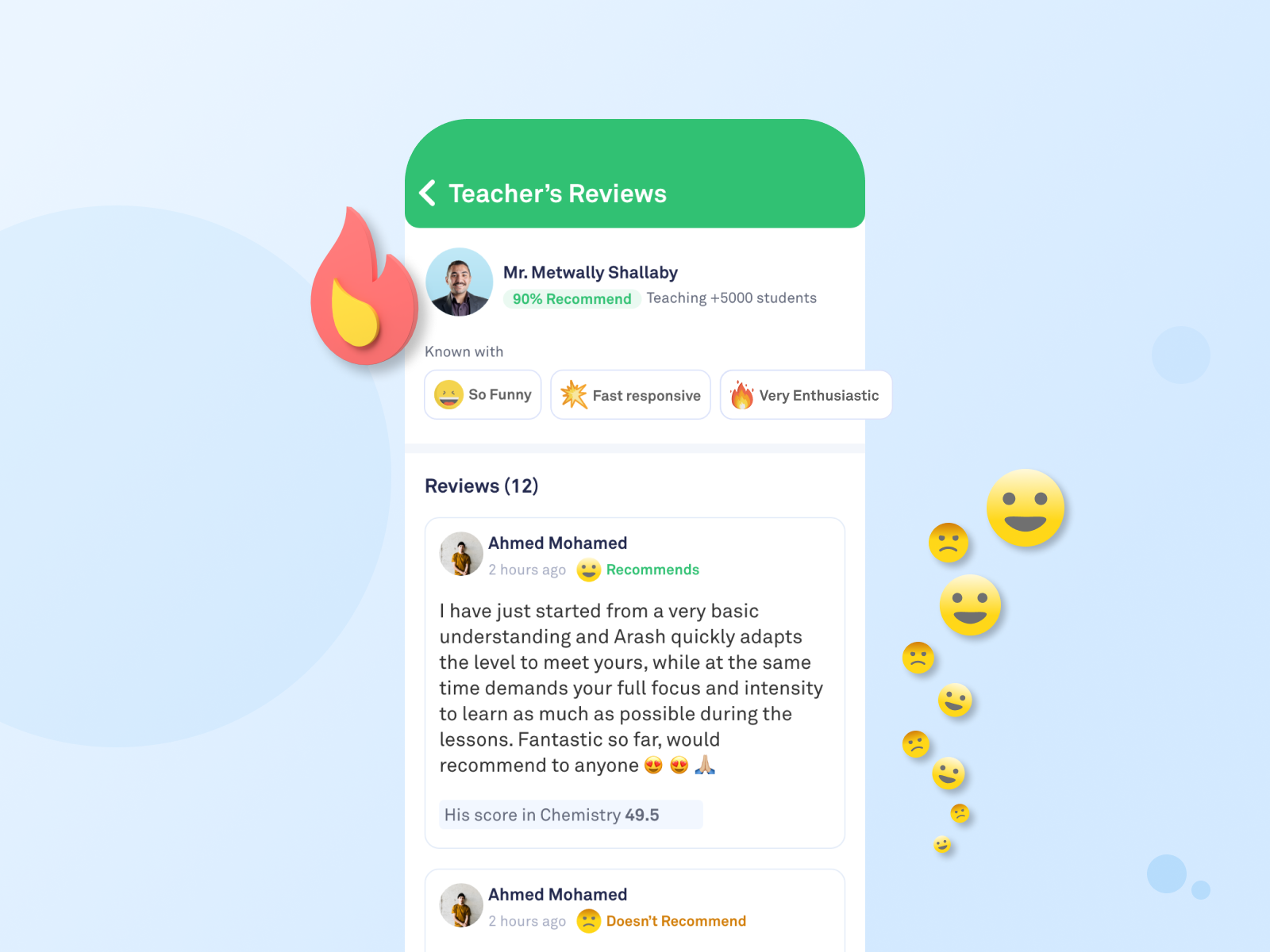
This is the perfect space for the teacher to show off, get a high recommendation rate, add how many students learn from him, and highlight his characteristics based on students reviews.
Now the students can view the course content, the progress till now, and when it started.
Students can see if this group is active or not through showing how many questions are asked, and how many students are competing together.
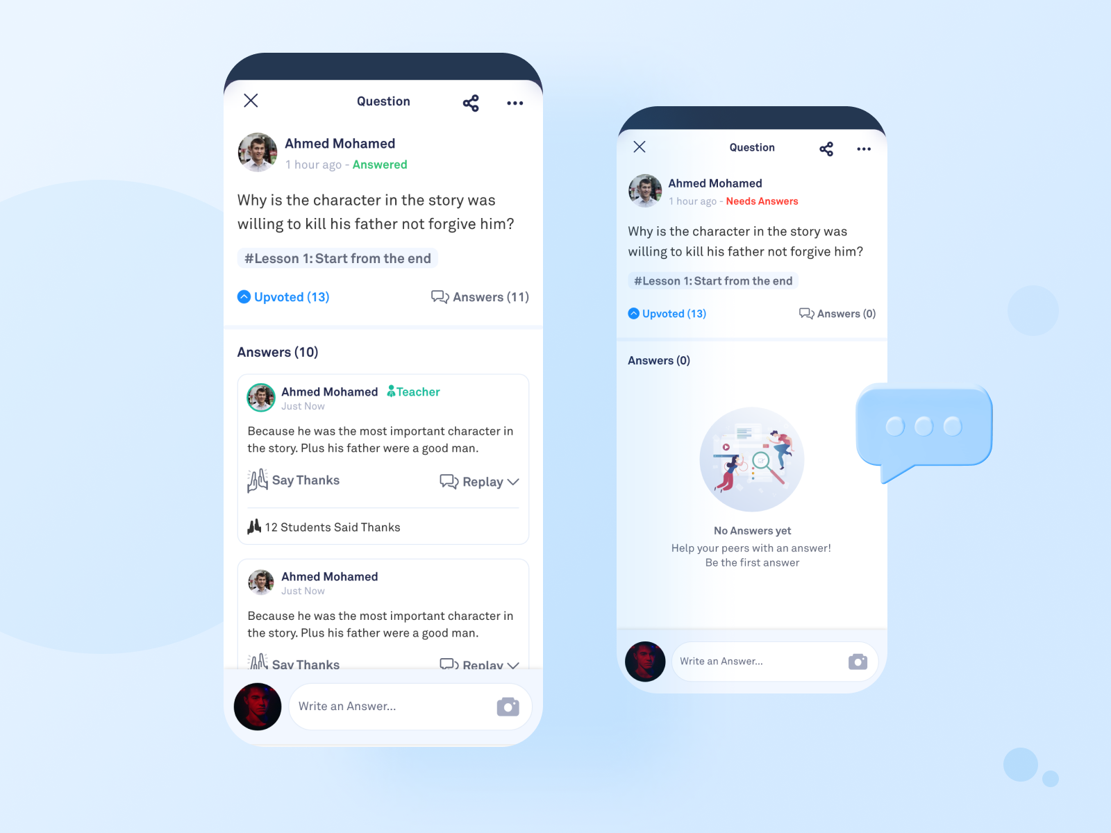
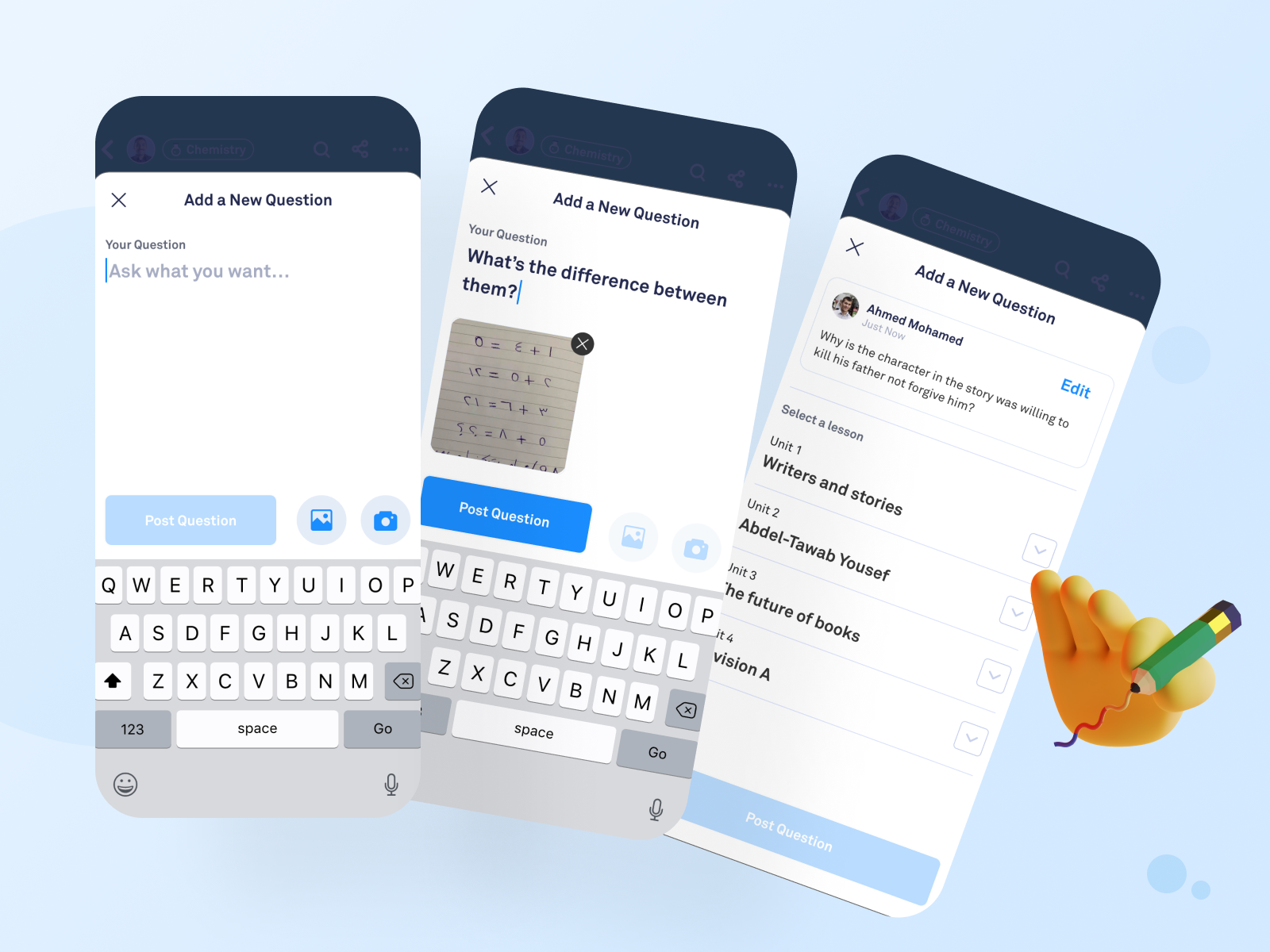
Here the students see the asked questions by students and answers.
Changing color for the header based on the subject of the group
Based on the student’s intent for joining the group, the expectations and goals definitely will change and increase after being a member.
So, what did we add in the group redesign (member view)?
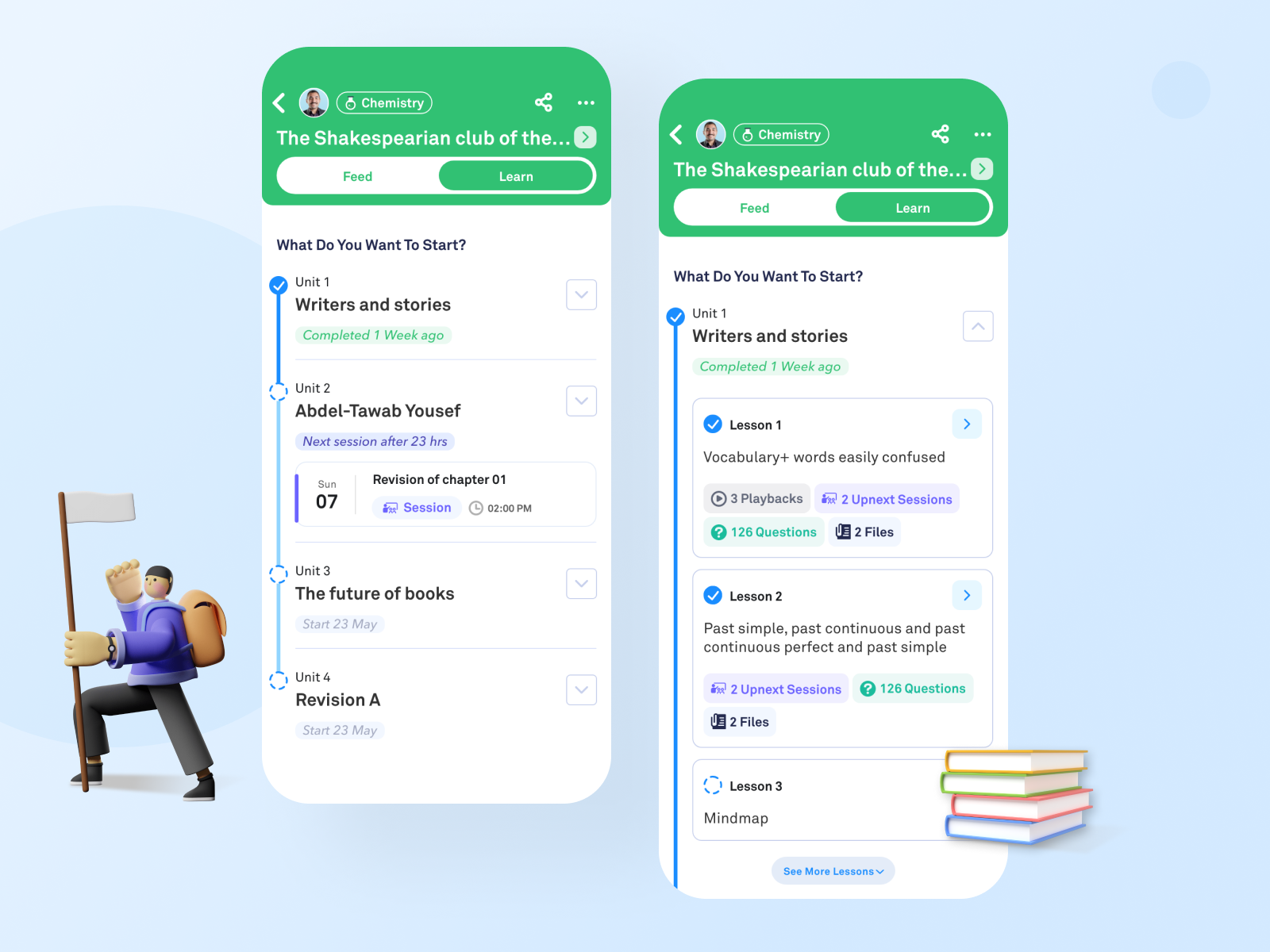
We split the group into two tabs: Feed and Learn
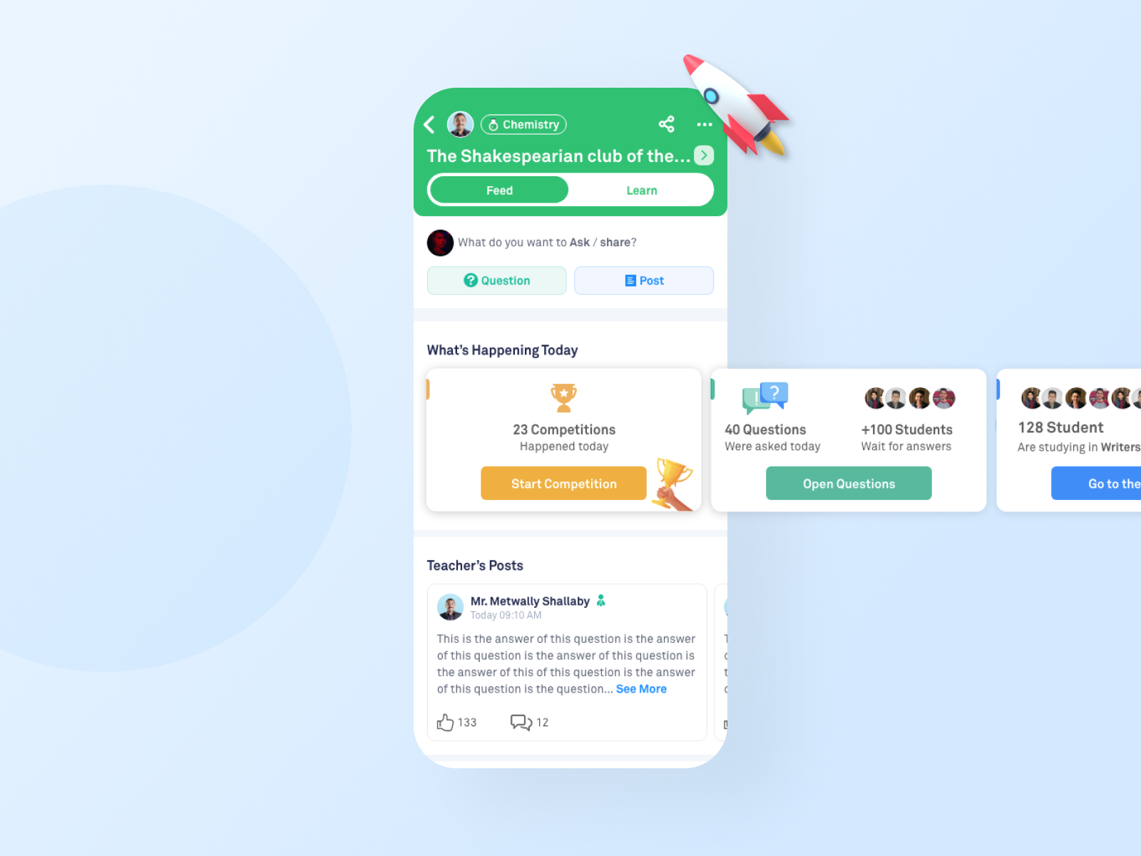
The Feed tab:
This tab is for interactions and activities.
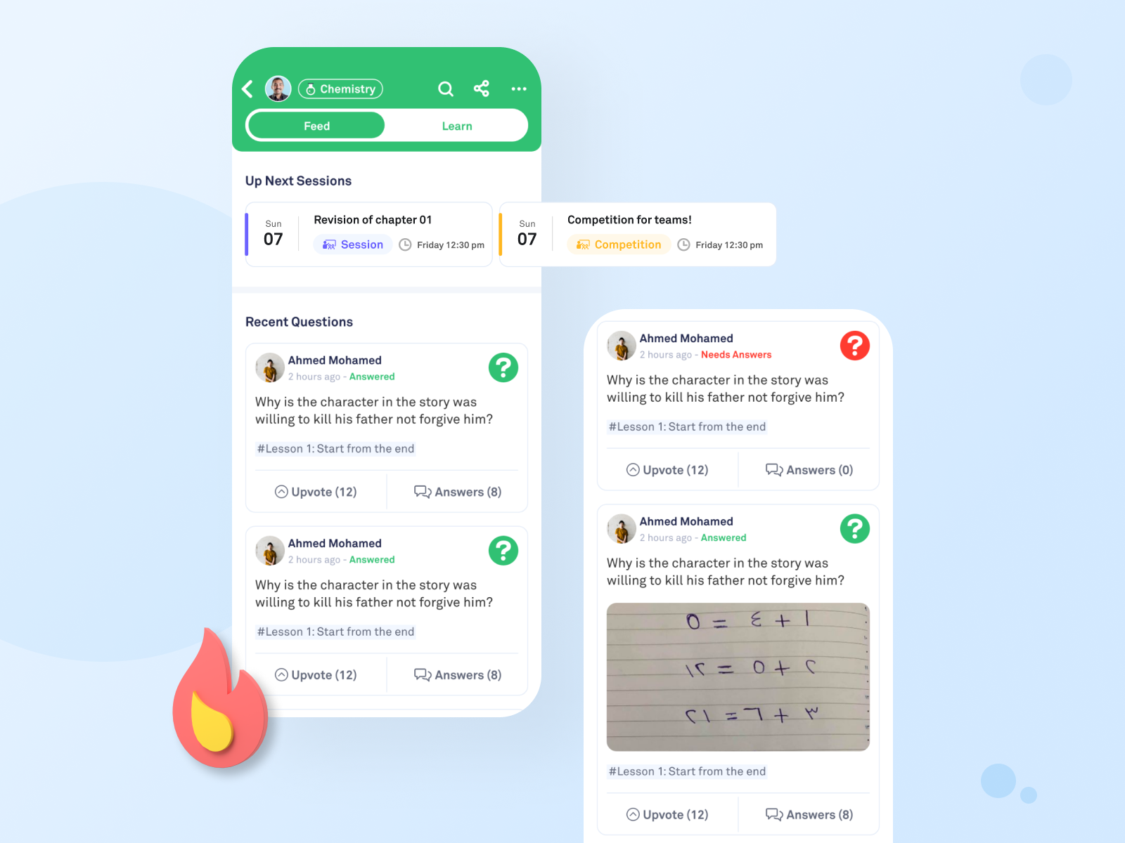
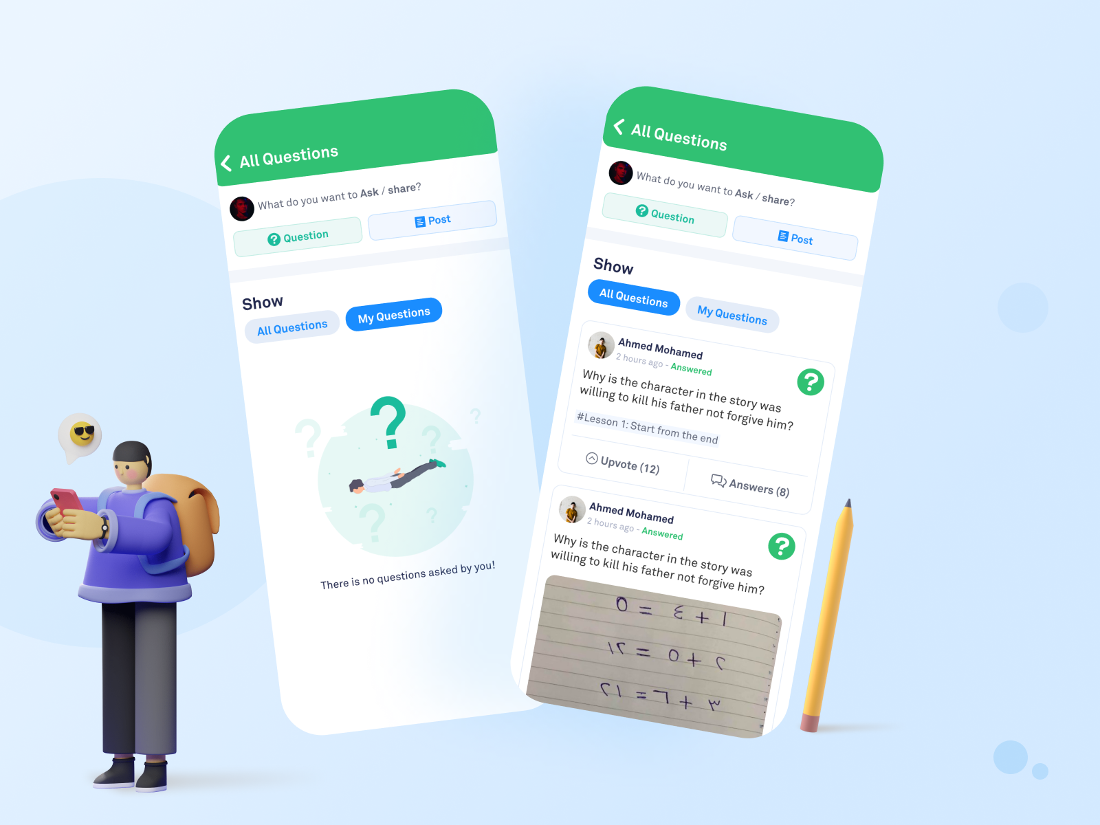
Students now are able to ask a question and see all students’ questions.
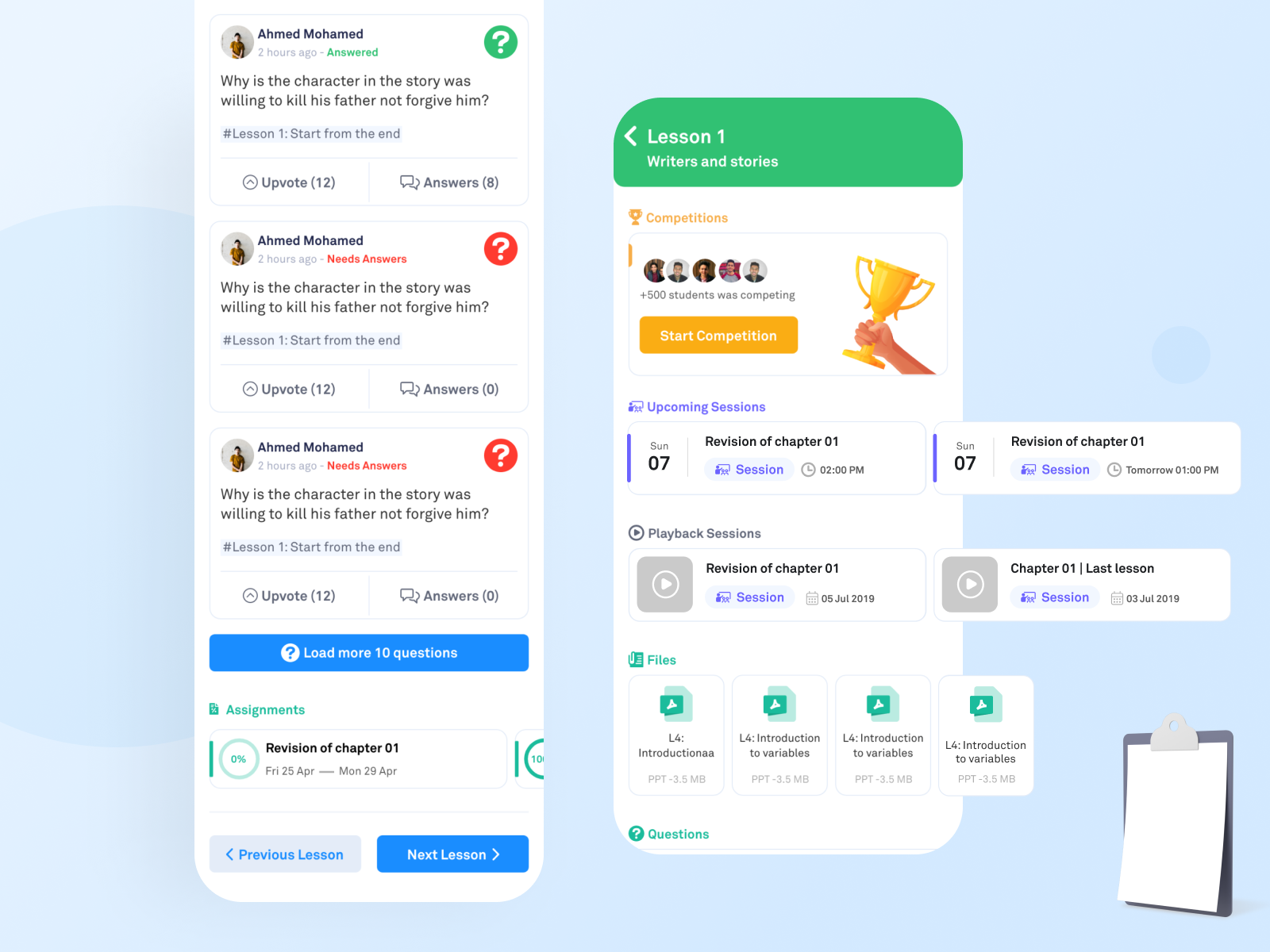
A brand new addition to the interface is the live track for the activities as: competitions, studying, and questions.
All announcements from the teacher now are in a separate section. This is a special place to get the latest posts and updates from the teacher.
Showing the upcoming schedule for sessions.
It’s not a new section, but we separated between the friendly posts from the educational questions.
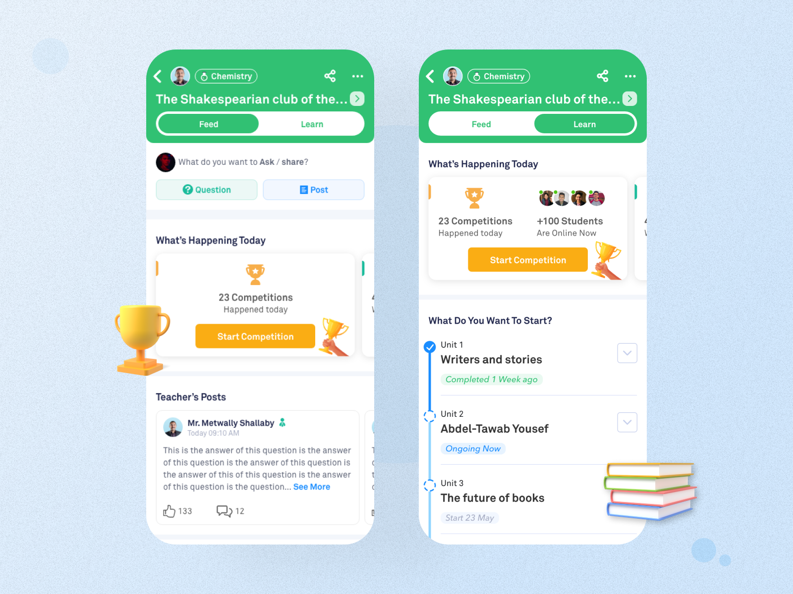
The Learn tab:
This tab is for browsing the educational materials that are finished or scheduled by the teacher.
The teacher creates the curriculum then adds the chapters and inside each chapter he adds a set of lessons. Each lesson has: scheduled sessions, recorded sessions, attached files, assignments, and questions related to a specific lesson.
This project is a long term project. New features will be added based on the variables and results.
Success metrics:
We did A/B Testing on the default tab (Feed or Learn) to observe which is better in achieving these success metrics.
Usability Testing Results (Done by UX researcher):
Thanks for reaching this point, I really appreciate it! I would like to hear a feedback from you
Made with love with Noonacademy awesome team