%20copy.png)
.png)
.png)

As a Freelance UI and UX Designer
The objective of GHATATY redesign was to enable a simpler browsing to users, create a more organized structure according to users’ needs, and to display important call-to-action buttons clearly that direct site visitors to sales.
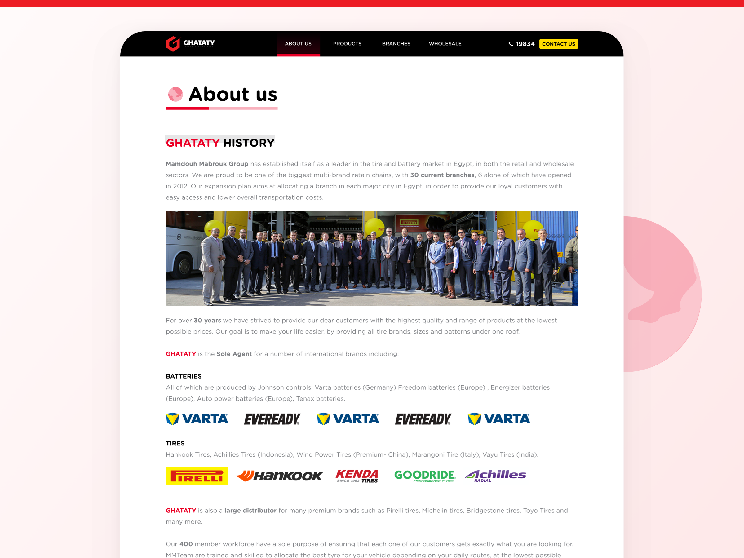
Mamdouh Mabrouk Group has established itself as a leader in the tire and battery market in Egypt, in both the retail and wholesale sectors.
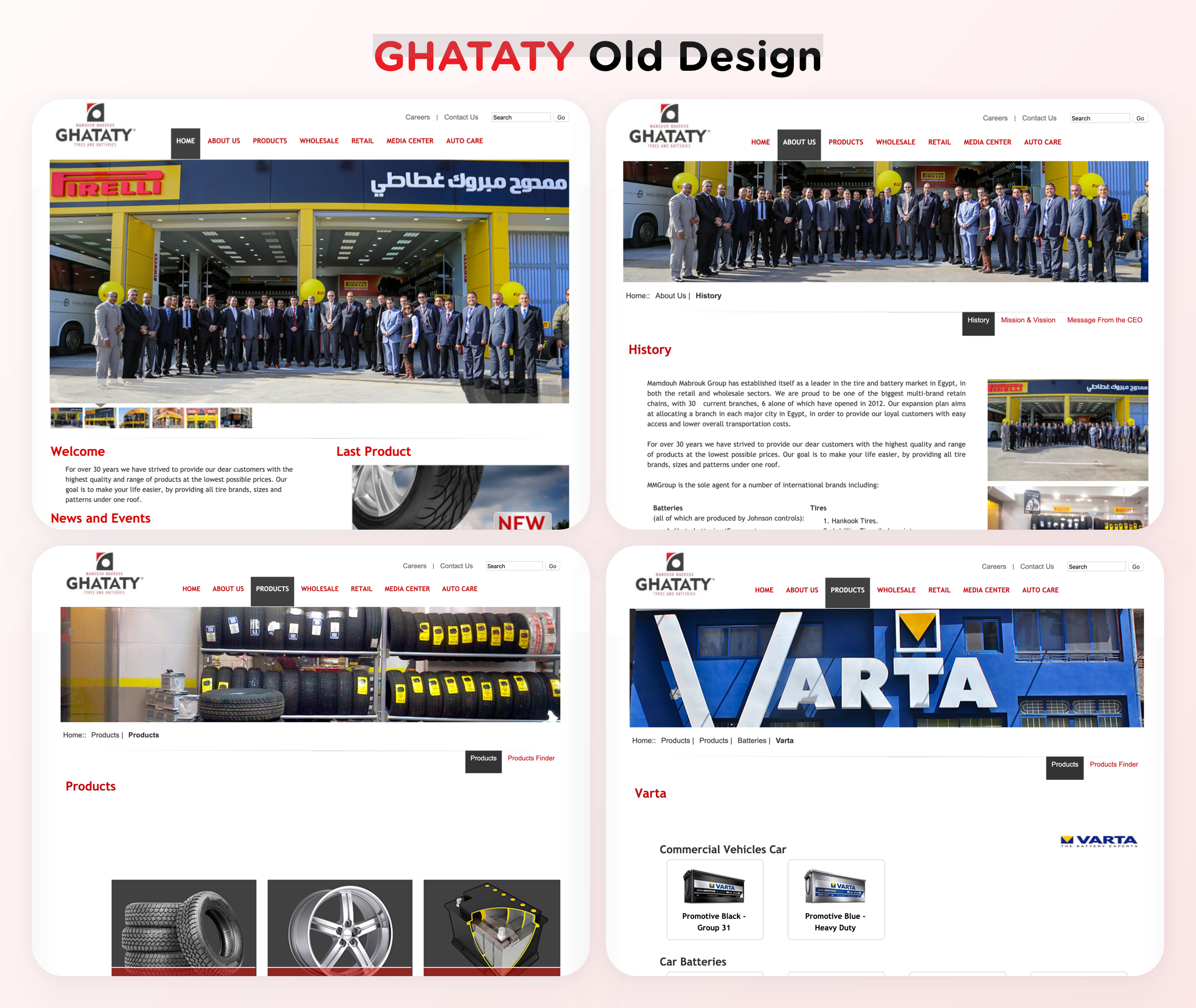
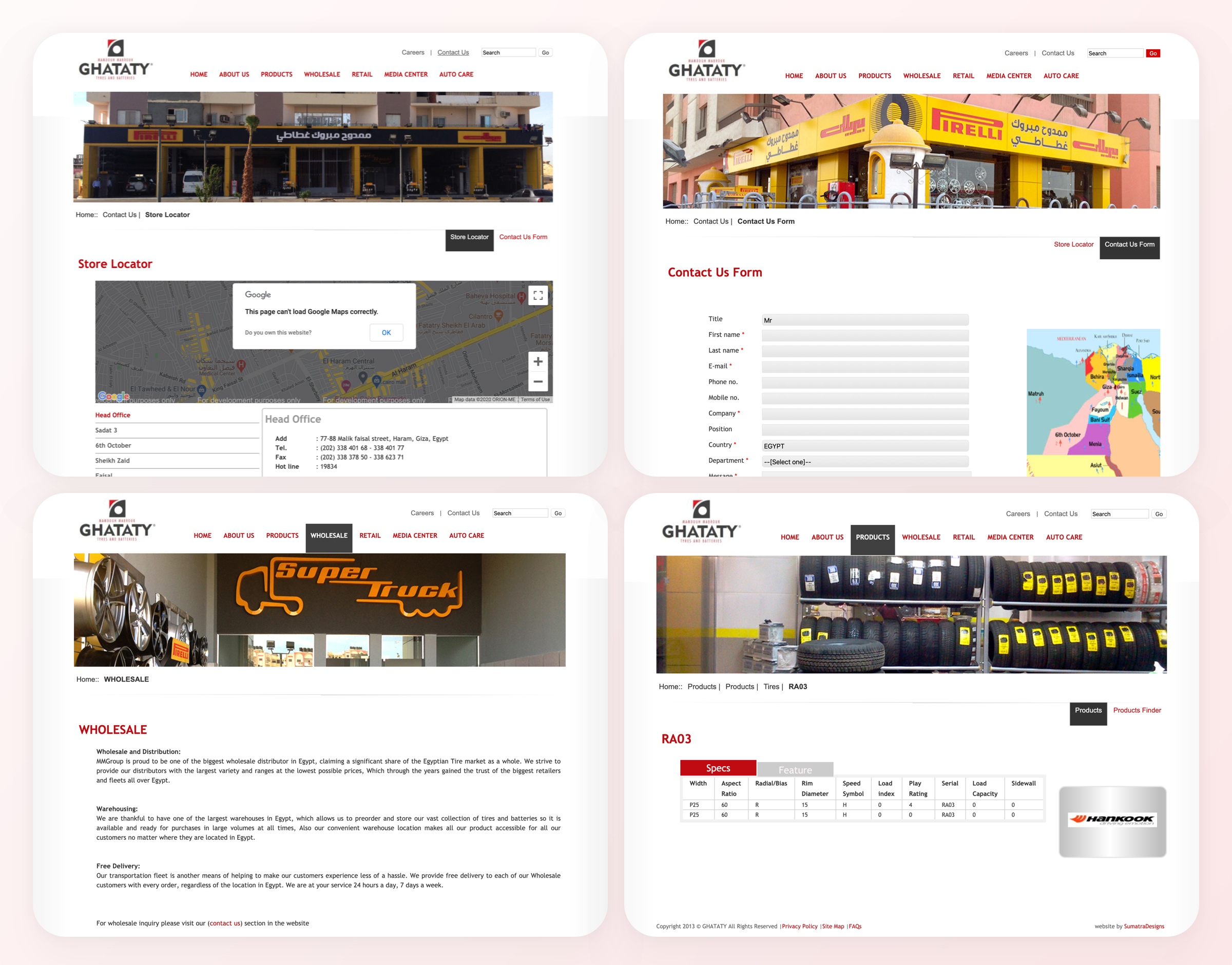
What are the problems before the redesign?
Here are the old designs, which has a lot of design and performance issues

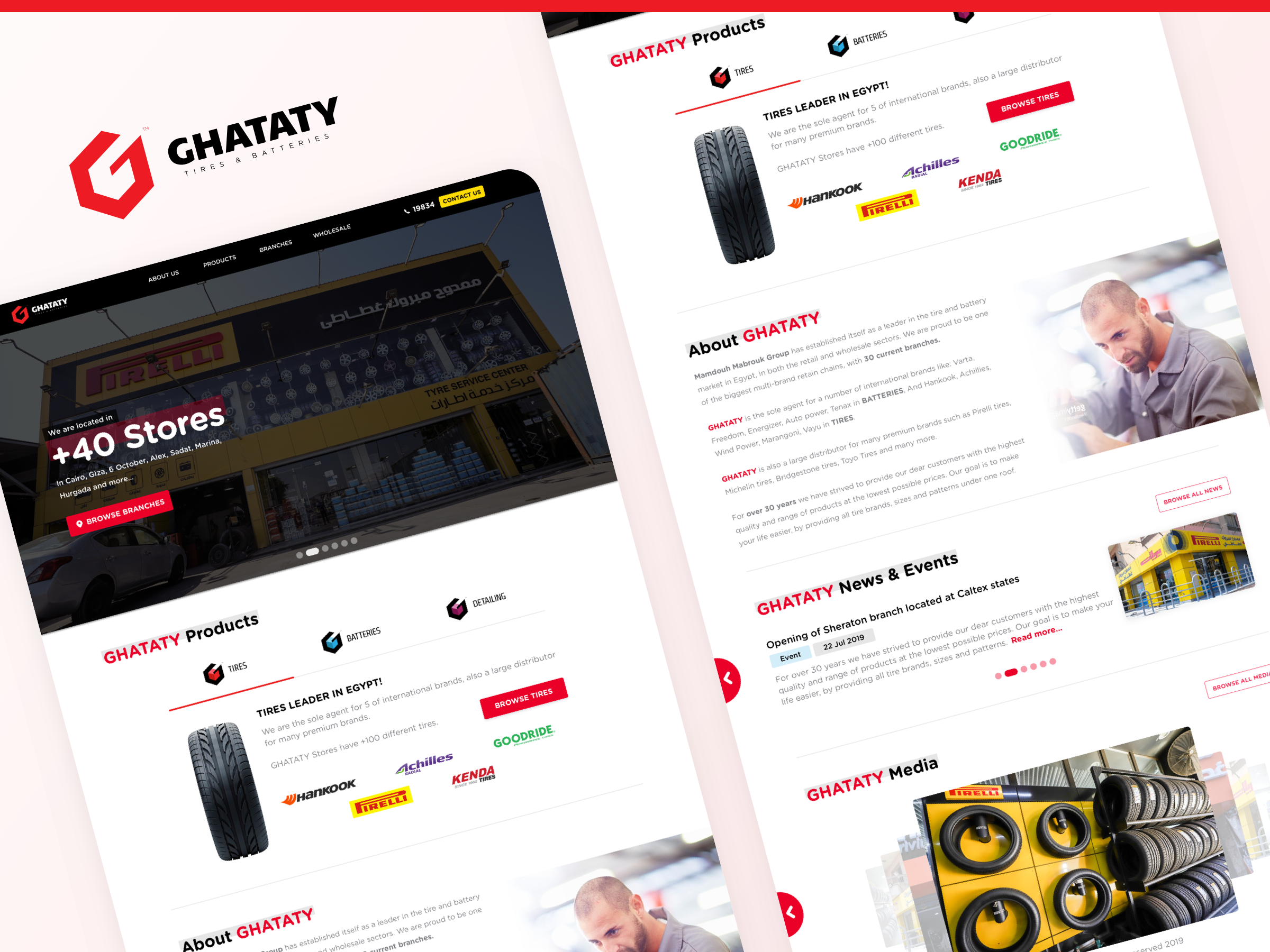
The header now displays the new logo and the main users’ needs divided into 4 tabs: About Us – Products – Branches – Wholesale.
Also, a new Call-to-Action button has been freshly added to enable visitors to directly call GHATATY hotline. The contact us button is highlighted at the top right. It is exactly what the website needed to increase direct sales as it was missing in the previous version.
The header is fixed in all pages which means the user can easily transfer between tabs and contact GHATATY at all phases of the user’s journey.
has been freshly added to enable visitors to directly call GHATATY hotline. The contact us button is highlighted at the top right. It is exactly what the website needed to increase direct sales as it was missing in the previous version.
The header is fixed in all pages which means the user can easily transfer between tabs and contact GHATATY at all phases of the user’s journey.

The home page is crucially important for the website success as it guides users through the website.
Core factors applied in the home page new design:
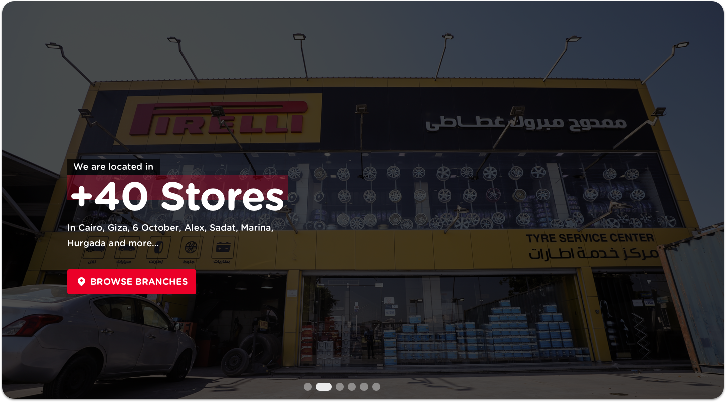
The image slider is way improved as it shows not only the featured images from GHATATY like before, but also comes now with short captions and direct Call-to-Actions.
How fabulous!
All promotions and special events are announced here to increase traffic via the buttons that link to different internal pages in the website.
Freshly added section!
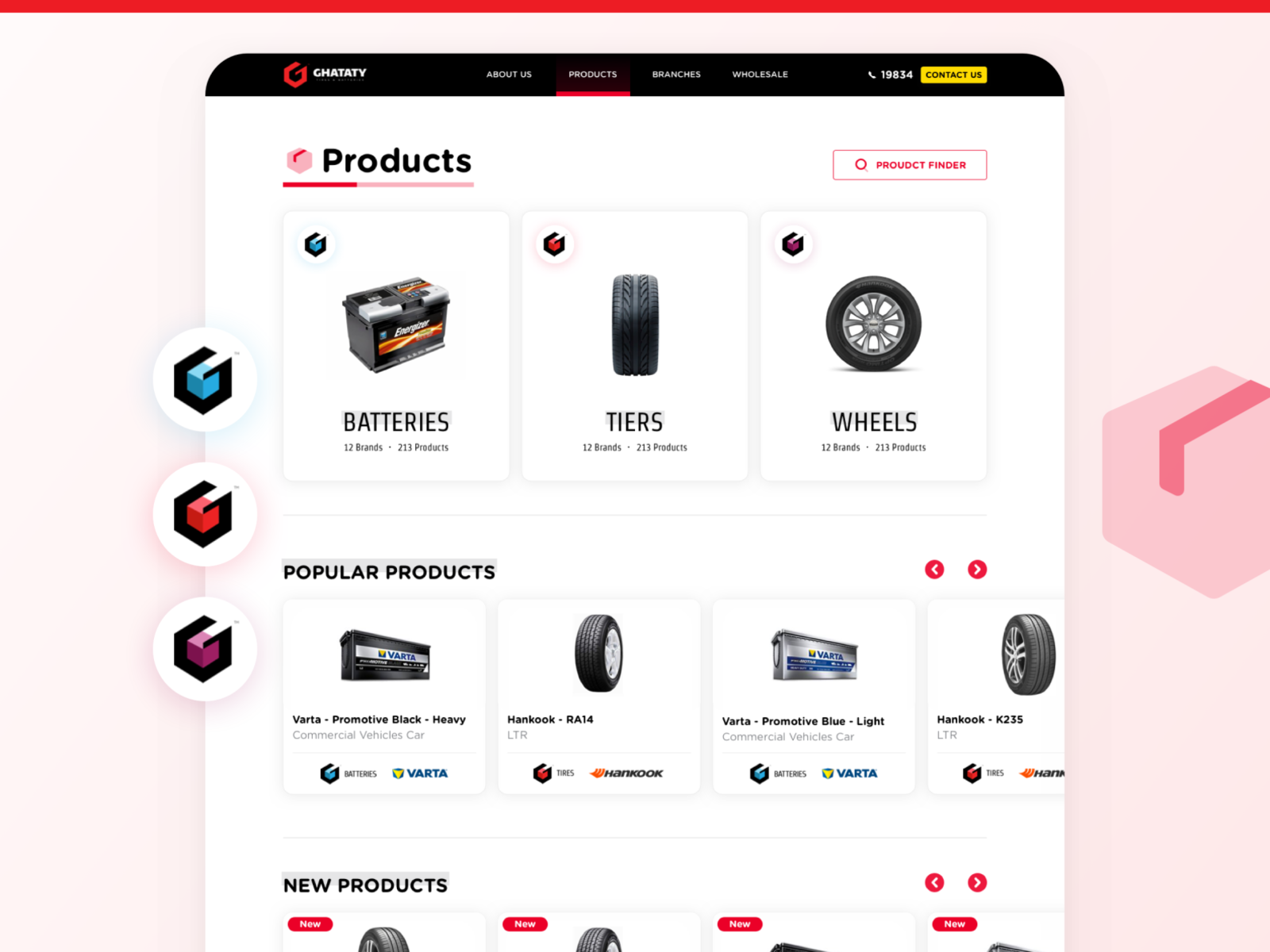
Previously, the user could only view the products by choosing the products tab. Adding this section, GHATATY can show their unique products to the users on the home page along with short descriptions. This will further encourage users to browse all products by clicking the CTA button.
GHATATY products are divided into Tires, Batteries, and Detailing.
Each division is given its unique sub logo. Also, the brands’ logos are added to show the users more details offering them better web browsing.
Previously this section had some r e a d a b i l i t y issues. So, these are the three steps applied to enhance the user experience:
First, some brand style guide additions are created and maintained throughout the website like writing GHATATY in capital letters and in red and writing important data and terminology in bold. This allows users easy skimming to absorb more information.
Second, this section is divided into small blocks.
Third, it comes along with a high-quality image.
Here, the user can navigate through news and events by the right & left arrows. This type of content is usually long, so it needed to be more organized. The solution to make long content readable is in adding: Tags.
The Tag below each title shows the category (news- event). Also, there is a dedicated tag for the date.
Users now can choose between two clear CTAs: whether to read more or to browse all news.
Adding this section to the homepage, the user is allowed more visual pleasure with its creative effect.
The user is urged to turn between the latest images from GHATATY gallery and view the captions or one can choose to view all media by clicking the CTA.
With the new redesign, all information is shown on one page that is divided into sections instead of the old and tiresome user flow of opening three different subtabs.
As this is almost the most important part of the website, it is essential to make the bigger sum of changes here.
So, what is new?

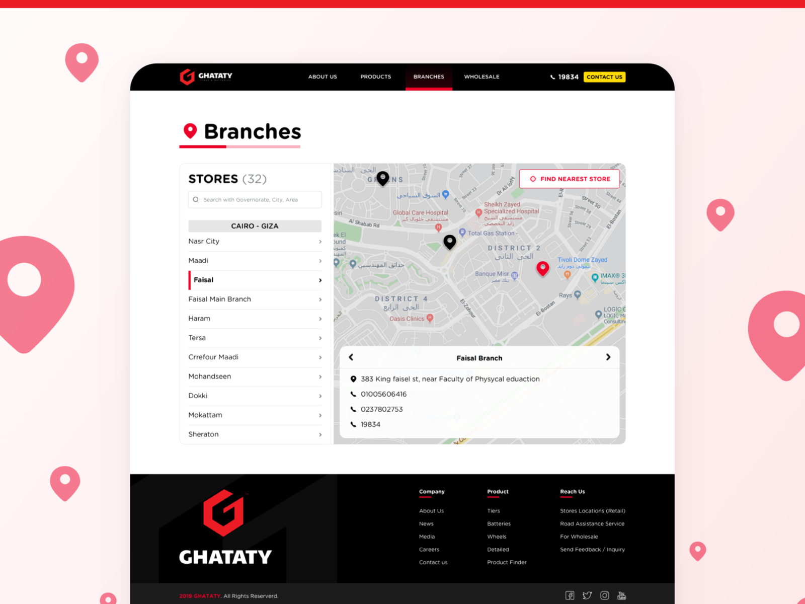
Users can easily switch between viewing different store locations in the same tab After the website redesign.
Instead of choosing between many locations from the dropdown menu, locations are shown in a slide menu with all stores belonging to the same area grouped together.
On the right side, Google map views the exact location in the background, and all branch details including address and contact numbers are shown in the foreground in a semitransparent frame at the bottom of the screen.
In addition, the search bar and the “find nearest store” button are added.
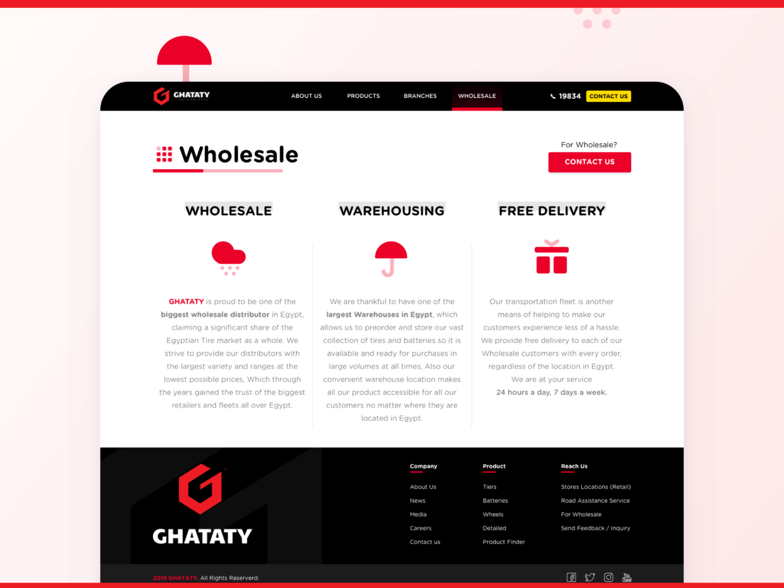
The new design focuses as well on design elements such as sizing, color, wording, typography, white space, placement of clever icons and the Call-to-Action button “contact us” which was missing in the previous design.
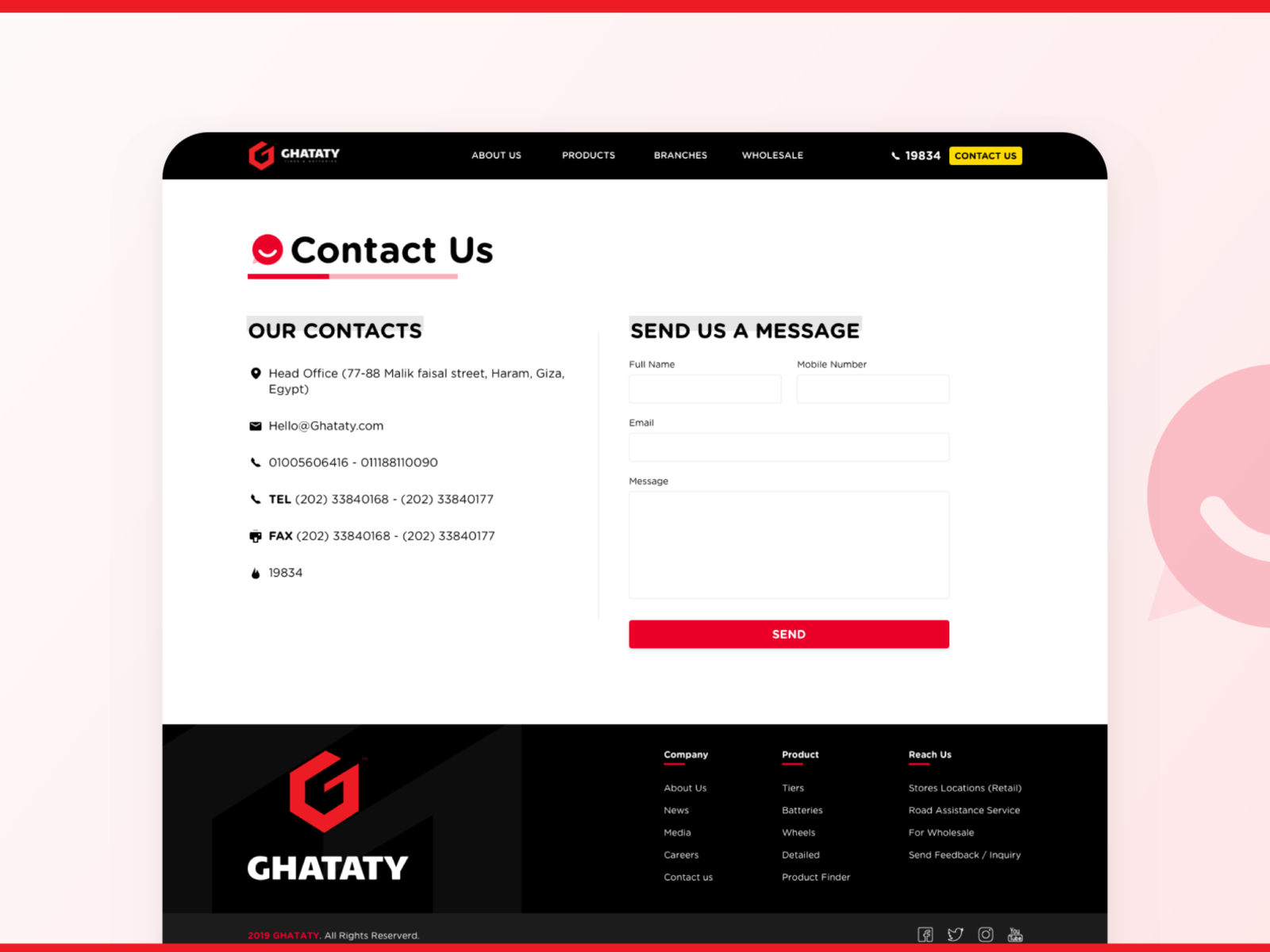
This page includes all GHATATY contacts and the option of sending a direct message to improve customer engagement.
The number of data required in the contact us form has been minimized to encourage more response.

Users can view this page from the direct link in the footer.
It shows all available vacancies in dropdown menus. This allows users to view the description of each position in the same tab.
Also, a new copy “why GHATATY” is added to this section to feature details on benefits and opportunities for advancement.
On the top right a CTA was added to encourage more talents to submit their CVs in order to reach them whenever there are available suitable positions.
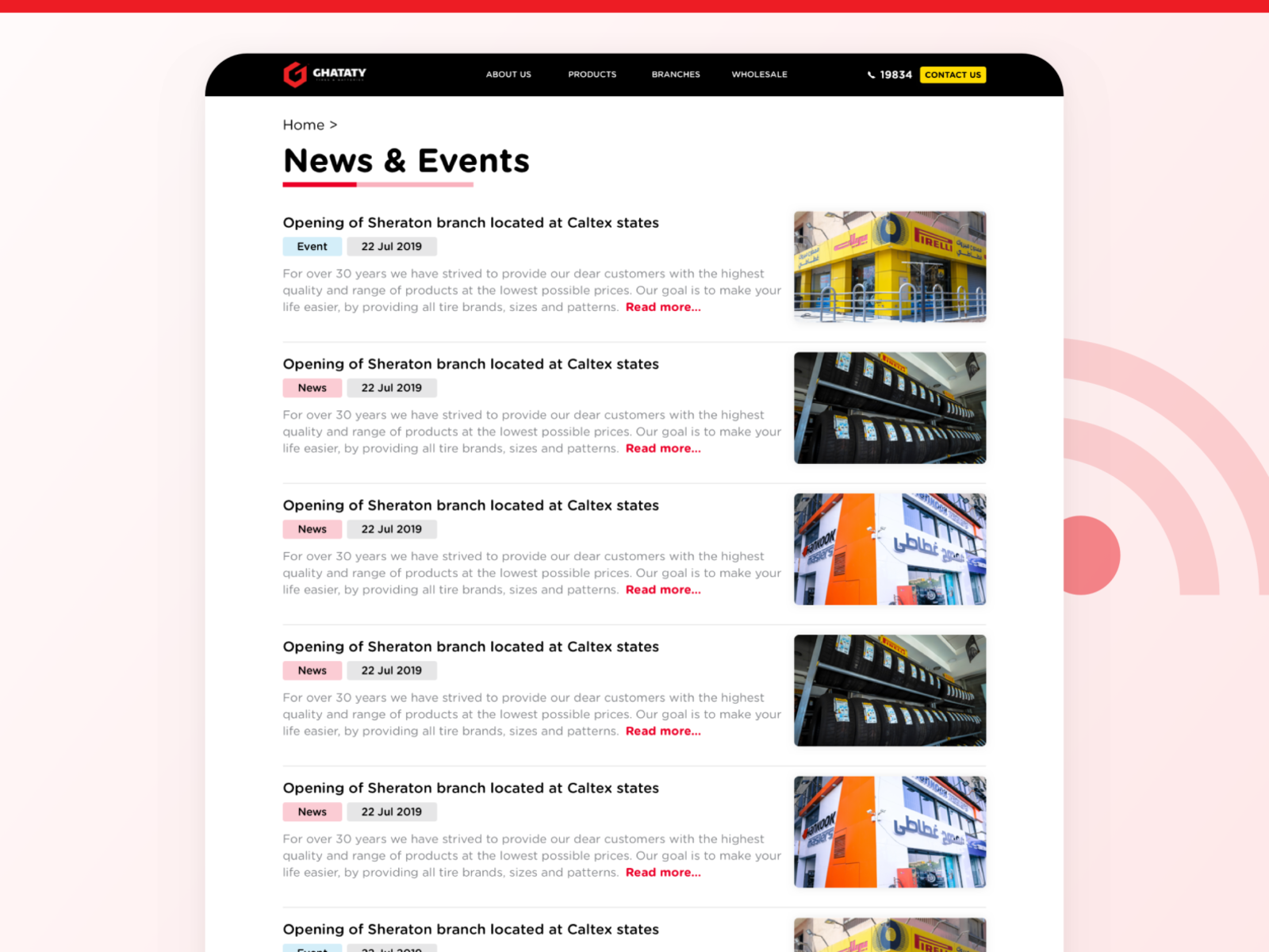
Here all news and events can be viewed.
The compiled gallery for GHATATY featured photos where they can be viewed along with their captions.
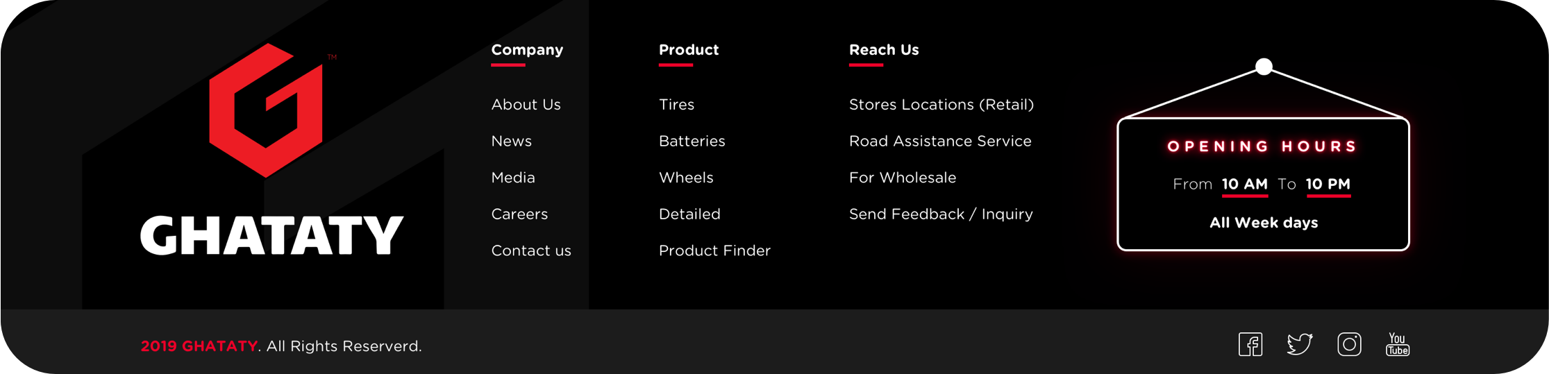
The footer is a new addition to GHATATY website.
It includes the new logo and useful links that are considered as shortcuts for the users.
The opening hours are highlighted in the store sign at the bottom right.
Visit the live version www.Ghataty.com
Want to write your own success story now? 🚀
Contact me on Hello@Khalifa.Design